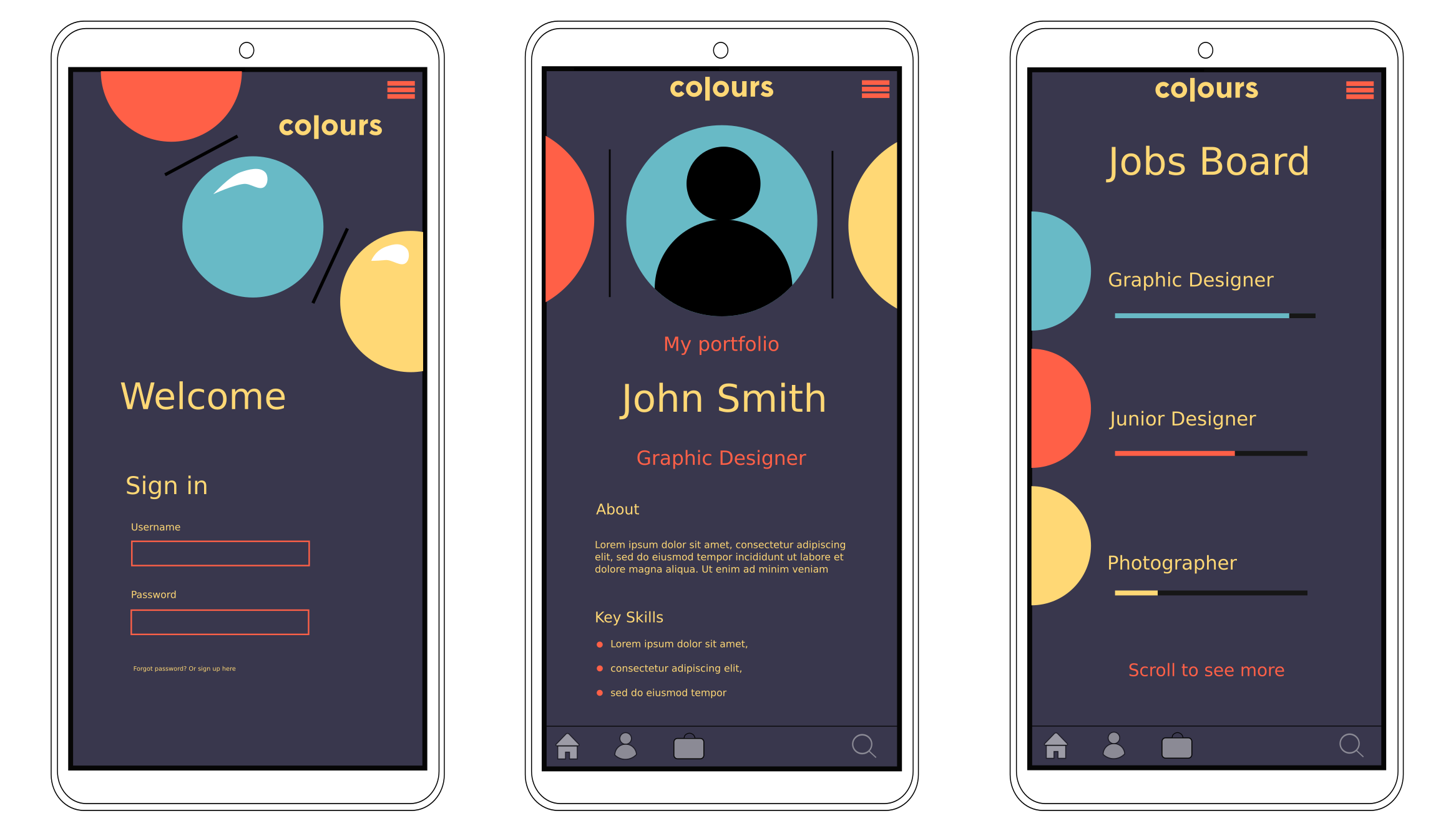
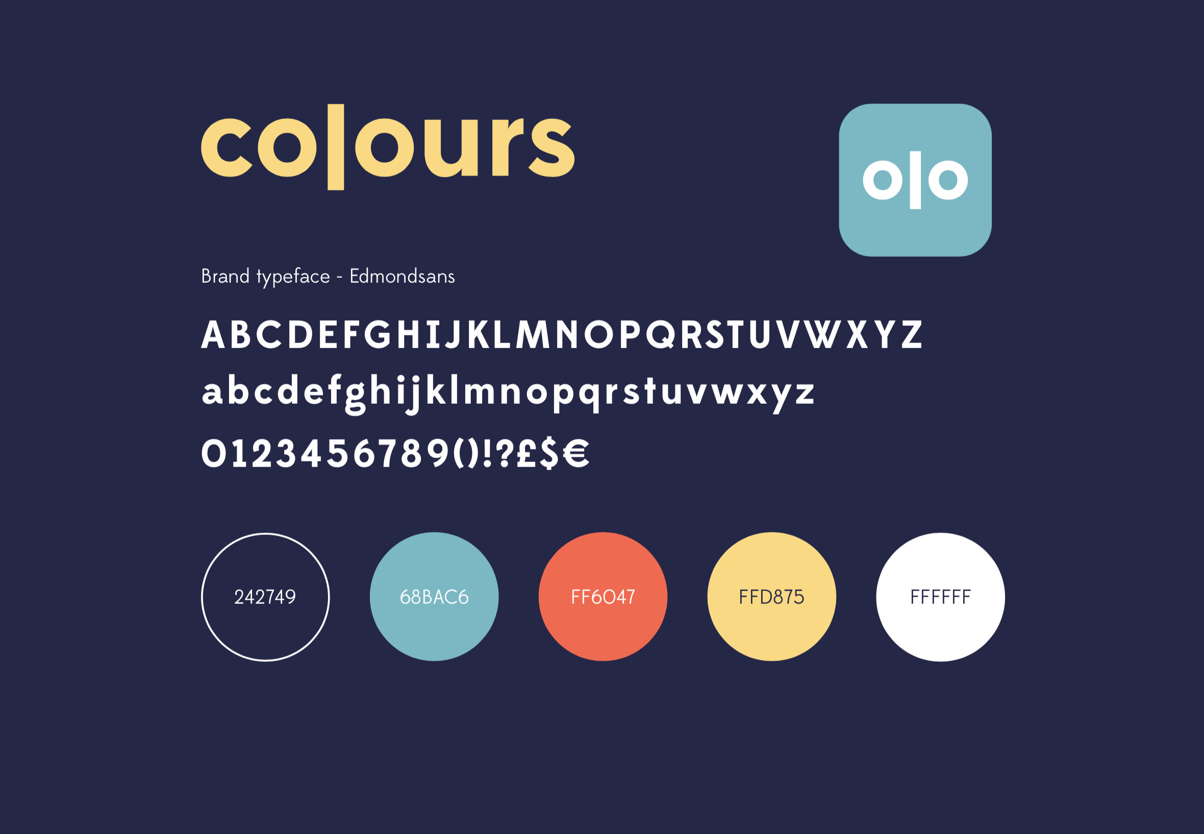
This was an interesting brief as it was the first one I completed that had a style tile provided. It contained the font, logo and theme colours which all had to be incorporated into the design. The app is called ‘Colours’ and it aims to connect creative professionals around the world.
I really enjoyed this brief, I found I came up with an idea pretty quickly as I thought the logo looked a bit like a paint palette with the two circles representing the dips where the paint is. I then used the colours from the style tile as the paint colours. I continued this idea throughout the three screens to tie all the pages together so the design felt consistent.
I had to remember to keep the app clutter-free as I discovered that well designed apps always contain a minimal amount of text and images so viewers don’t feel over-whelmed. Following this, I only used 3 types of fonts and spaced out the text and icons so there’s a good amount of white space.
The Jobs Board contains three bars next to each job that are filled with different amounts of colour. These represent how suited the role is based on your individual skill set. This helps people to easily find jobs more suited to them so they can quickly overlook the irrelevant ones. I chose roles with clear titles as examples but in reality there would be less obvious titles where this feature would be most useful.