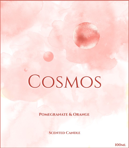
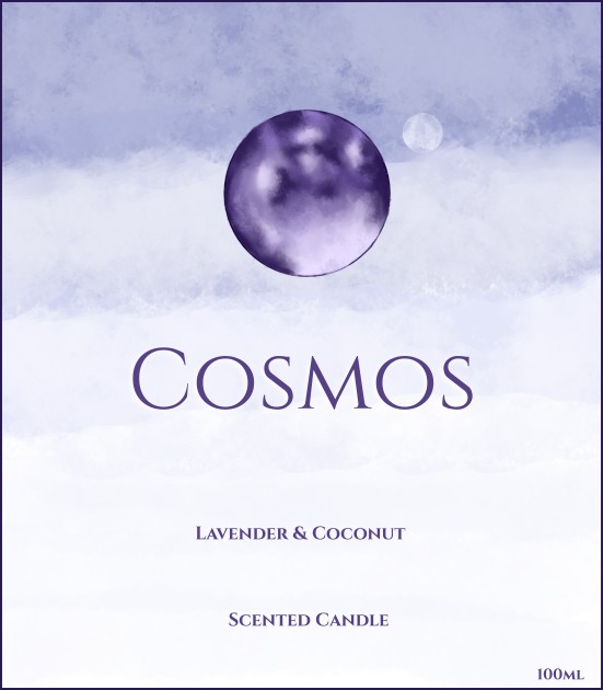
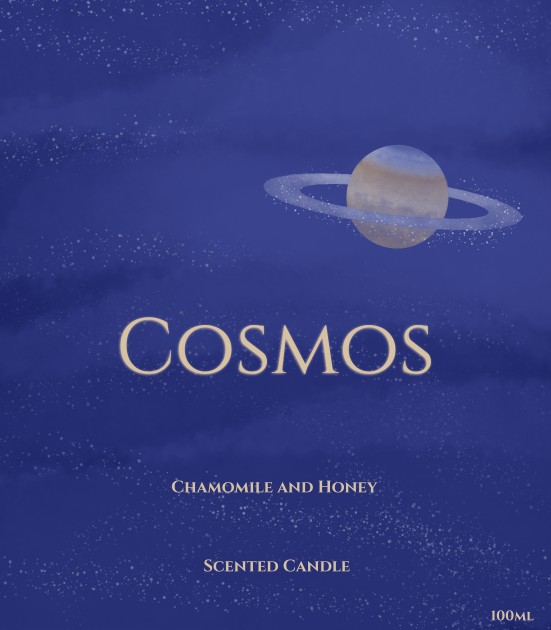


This was another practice brief from Briefbox. For this project, the instruction was to create three labels for an ethical and organic candle brand targeting women from ages 25 - 65. As with other briefs, they provided a style tile with the logo and the colour palette.
They wanted a natural look that uses or mimics watercolour/gouache. At first I tried using actual watercolour paints and I painted the moon. However I didn't end up using physical paintings for the label as scanning it lost a significant amount of detail. Instead I used a digital painting program called Krita with my graphics tablet to create the label art and Inkscape for the text.
I decided I wanted to use the space theme to reflect the brand's name but I wanted it to also reflect the flavours of the candles. I must admit it was challenging to think of three different designs that were space themed and also fitted with the aesthetic of the brand. However, I spent time playing around with composition, different planets and colours.
The lavender and coconut label came to me first with the purple theme and a moon which both went well together. For the pomegranate and orange candle, I thought of Mars to reflect the reddish colour and used a large brush to create a large cloud-like background. Then for the chamomile and honey label, I went with Saturn as it contains some yellow tones. I had fun with the brushes on Krita to create the starts and clouds in the background.