For this brief I had to design 2 double page spreads and a front cover for a new seasonal lifestyle magazine. The magazine's aim is to be innovative and have a minimalist style. The target audience is 20 and 30 year olds and it’s a relatively expensive magazine released every quarter so it had to be good quality.
This edition was for autumn so it had to have a ‘cosy cabin in the woods’ feel. The specific theme focused on ‘outdoors, hiking, beautiful forests, mountains and lakes.’
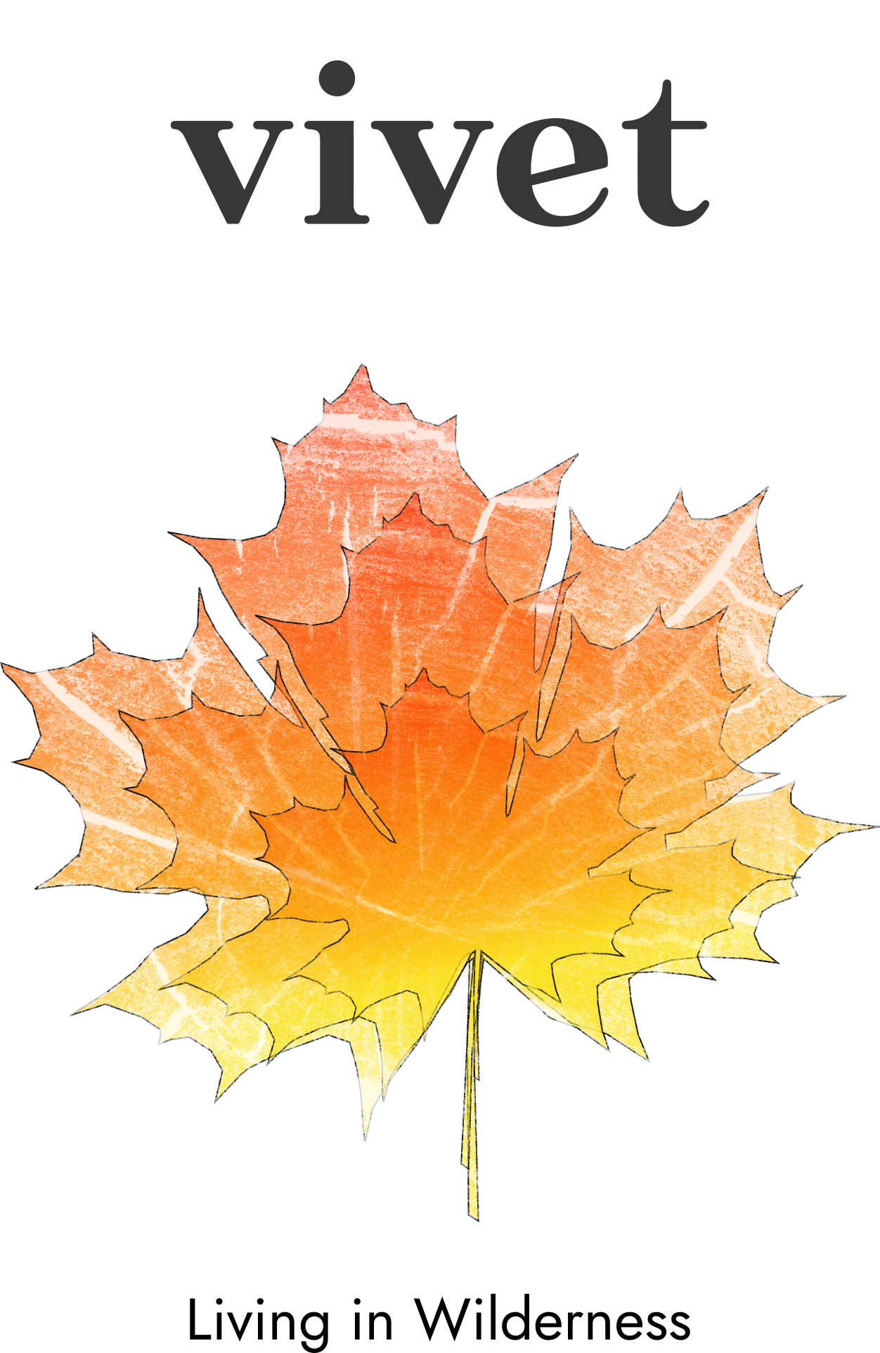
For the front cover we had the option to choose a photo or an illustration, I did a mixture of both. I drew an outline of a leaf and then inserted a photo of the inside of a tree then applied filters to give it the autumnal colours and texture. I repeated this 3 times to make it more eye-catching without making it too busy as the magazine focuses on a minimalist style.
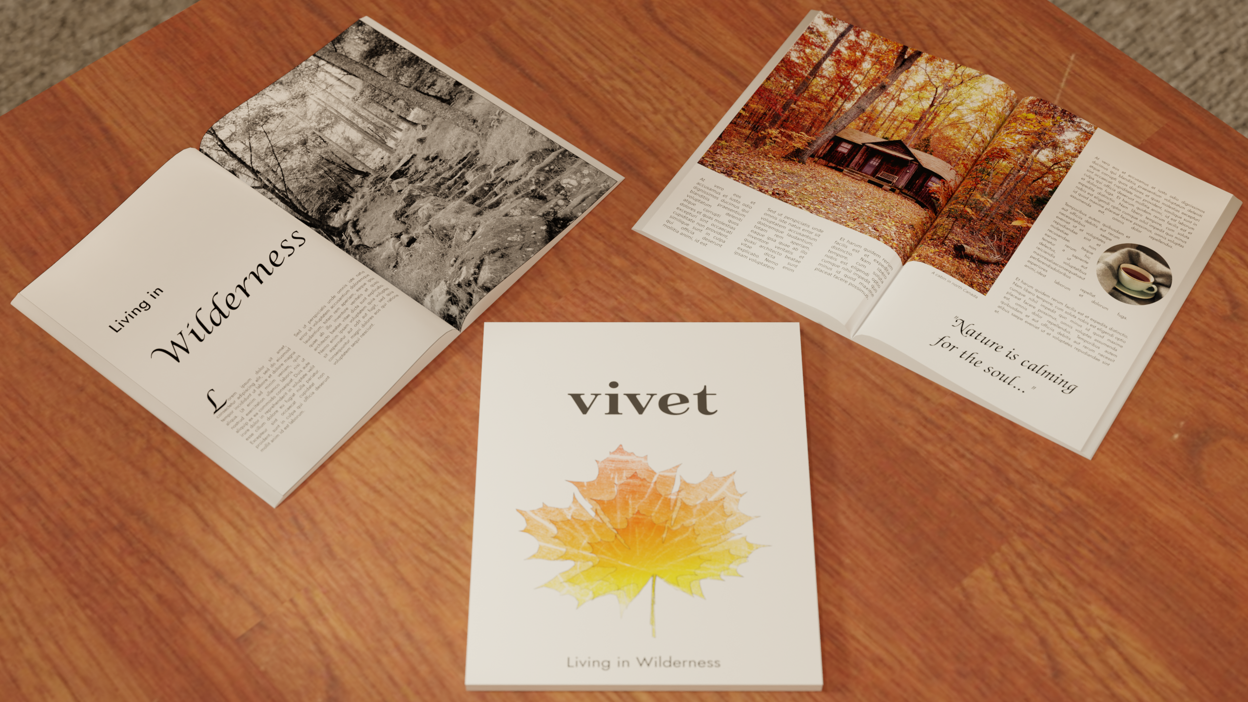
For the first two page spread, I tried to stick to the minimalist approach. For the first page, I enlarged the title font so it covers more than half the page then I only placed two paragraphs to continue that clean style. I have observed this style in other magazines, I like how the white space creates high impact. I decided to put an image I took in the Lake District on the second page as I thought there should be minimal text in the introduction to the article.
For the second two page spread, I placed a lot more text around the images as this is where the main article sits. I played around with wrapping the text around a circular image to have something for the eye to be drawn to rather than a wall of text. These images are in colour to contrast against the monochromatic theme of the previous spread.