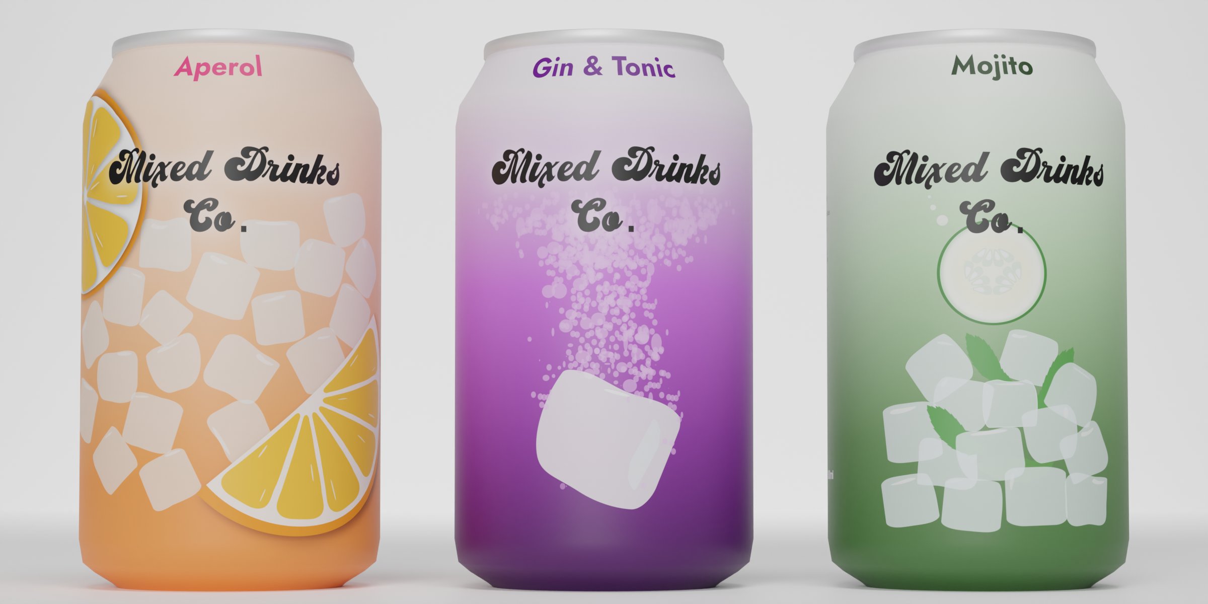

This was the most fun brief in my opinion. The task was to design three non-alcoholic drinks cans: Mojito, Gin & Tonic and Aperol Spritz. Briefbox supplied some images that the brand liked so I had to follow a similar theme which was bold, colourful and clear illustrations.
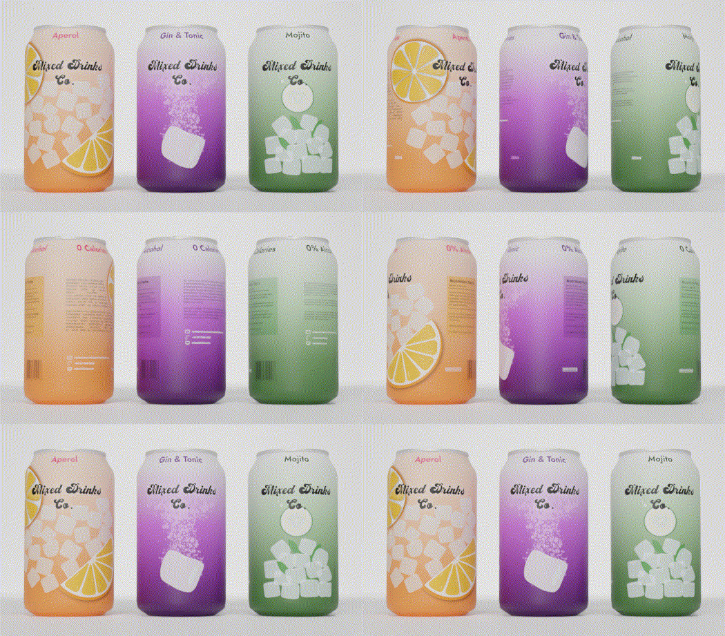
I knew I wanted some big fruit illustrations so for the Aperol Spritz I drew two orange segments on Inkscape. Initially I tried to squeeze both on the front of the can with the ice cubes but it got too busy. I didn’t want to remove either of them so I moved them both round the sides of the can which looked a lot better, it also created more interest around the whole can rather than just the front.
The Gin & Tonic can is my favourite design. At first I struggled to think of a design which related to a gin and tonic as no images came to mind except clear liquid in a glass with ice. This is where I thought I would create a illustration which had the ice cube as the main focus. I thought if I introduced motion into the picture with the ice cube being dropped into the liquid, it would be eye-catching and would make the humble ice cube more interesting. I think it's the most effective one out of the three designs as it’s simple and striking.The Mojito I designed to look like the whole can was showing what a Mojito cocktail looks like with the ice and mint leaves at the bottom and a cucumber added on top. This is when I got the idea for the gradients as a cocktail is normally darker at the bottom than the top. I applied this to all the cans to create continuity in the designs so if someone saw them on a shelf they would be able tell they were all from the same company.

As for the font, I went for a swirly 70s style font called ‘Vintage King’. I thought this was a good fit as it was bold and fun but clear to read.
I learnt how to use the program Blender for this brief as the mock up cans that were provided didn’t work on my Linux computer. It ended up being a blessing in disguise as it’s been good to get familiar with it. With the help of my husband we created the cans and the backdrop then rendered a high quality image of the three cans.